-
 Mon 25th Jan 2010 17:43 #41 / 56
I like the current design, but I think more vivid player colors would be better imo. (easy to mix up black & blue eg. here: http://img695.imageshack.us/img695/2930/jshot.jpg )
-
Mon 25th Jan 2010 18:05 #42 / 56
Happy Birthday to the ground!!!
norbip wrote:
I like the current design, but I think more vivid player colors would be better imo. (easy to mix up black & blue eg. here: http://img695.imageshack.us/img695/2930/jshot.jpg )
It's a pretty clear distinction to me, but i'll make some tweaks.
-
Mon 25th Jan 2010 19:13 #43 / 56
Happy Birthday to the ground!!!

Old New
-
Mon 25th Jan 2010 21:49 #44 / 56
For the record, I'm playing my first game with the "new" compromise version and I can't stand it. Anybody who favors this over the full-fill version is wrong.
In certain areas of the map I can't tell the difference between Navy and Purple or especially between Yellow and Taupe.
EDIT: Although I will say I do appreciate the effort to mollify me by renaming "Blue" to "Navy" even though it looks like you actually lightened it.Cramchakle wrote: [anything]
I agreeEdited Mon 25th Jan 21:50 [history]
-
Tue 26th Jan 2010 03:21 #45 / 56
Risky's kinda-a-big-deal-ness was so massive it spilled over, so I'm handling the excess here.
So, I had an idea a while back that I bounced off of Tom but he got busy with so many of the other necessary things that I'm sure it got forgotten. I think what I have in mind could help to satisfy the two camps on the visuals of Europe 1560.
The idea was basically this:- Designers would be able to upload two separate image files.
- One file would be the "Fill Layer" graphic, while the other would be the "Screen" graphic.
- The fill graphic could be just the same as what we are currently using as images and would contain the areas that the Flash Player would use to run the game board.
- The Screen layer could include transparency so that we could essentially have more complex graphics super-imposed over the territory color-fill area.
Specifically for Europe 1560, this could mean that we'd have the best of both worlds with a fill style map while still having the cool map image of the original being super-imposed over the top of it.
That's not all though, we'd also be able to actually represent island chains that belong to one territory and don't have to appear to be connected in order to get the fill to work. And, we'd be able to make the screen layer give the look of anti-aliasing over our fill layer so we would no longer have to have blocky-looking edges.
I thought then, and still think now, that having the ability to have two separate image files could easily made WarGear game boards the visual leaders in the online Risk industry.
-
Tue 26th Jan 2010 03:29 #46 / 56
Wow. That is a brilliant idea.
Cramchakle wrote: [anything]
I agree
-
Tue 26th Jan 2010 07:02 #47 / 56
asm wrote:
For the record, I'm playing my first game with the "new" compromise version and I can't stand it. Anybody who favors this over the full-fill version is wrong.
I also just started my first game on the new board, and I must agree with ASM, I am finding it rather difficult to play. I appreciate the time Cram put into it, but dare I say that I would prefer either of the earlier versions. I would be surprised if anyone that has played the new one would disagree.
Oh dear, if only I knew what I was starting when I innocently made the initial post on this.

-
Tue 26th Jan 2010 10:17 #48 / 56
I think I like the overall ideas by Toaster (doesn't some Risk website use something like this?, maybe not, maybe I'm just remembering the proposal by Toaster on WF :P), although at first it does sound a bit complicated as far as a map making tool, but would probably just be a learning curve for a while.
Toaster wrote:That's not all though, we'd also be able to actually represent island chains that belong to one territory and don't have to appear to be connected in order to get the fill to work.
Lol, after playing WF and here this would probably thoroughly confuse me when I see a chain of islands all as one territory without at least a single fill line manually connecting them :P. I believe you could do this on Warlight though, and it seemed to work there (although the interface was pretty slick there so it was slightly easier to see it seemed).
What's Your Passion? A cure? Three simple molecules? Building for the small? Compassion for children?
Seek Yours Today. Get Uncomfortable.
-
Tue 26th Jan 2010 11:04 #49 / 56
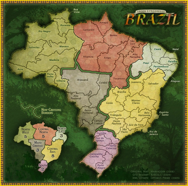
It seems like the second overlay graphic could be optional, right? Would this feature allow for maps that look more like this, where you don't have uniform-colored fills? http://maps.conquerclub.com/Brazil.L.jpg
I think DennisG does have a point that territories filled with a single color can appear a little flat.
-
Tue 26th Jan 2010 11:38 #50 / 56
Norseman wrote: It seems like the second overlay graphic could be optional, right? Would this feature allow for maps that look more like this, where you don't have uniform-colored fills? http://maps.conquerclub.com/Brazil.L.jpg
I think DennisG does have a point that territories filled with a single color can appear a little flat.Yes the overlay graphic would allow that.
-
Tue 26th Jan 2010 19:02 #51 / 56
Toaster wrote: lots of words
This is the best idea I didn't have in ages!
It doesn't even sound that hard. If you allowed a second overlay image with some sort of transparency you could even go back and make existing fill mode maps look awesomer with hardly any effort at all.

-
Tue 26th Jan 2010 20:22 #52 / 56
Happy Birthday to the ground!!!
I took some time out of my busy day of stirring up trouble and made some revisions I hope you'll like:
Awaiting public scrutiny:
http://www.wargear.net/boards/designer/547
For reference:
http://www.wargear.net/boards/designer/465
This should be a bit clearer. Drastic changes aren't likely to happen, but I hope you appreciate the subtle differences that make things more playable. I haven't released the update yet, as I only want to do so once more. Please submit specific feedback so that I can try and incorporate any other changes. This is the peoples' map, after all.Edited Tue 26th Jan 20:24 [history]
-
Wed 27th Jan 2010 15:52 #53 / 56
Happy Birthday to the ground!!!
Update with altered graphics released.
-
Wed 27th Jan 2010 20:02 #54 / 56
I appreciate the subtle differences that make things more playable.
Cramchakle wrote: [anything]
I agree
-
Wed 27th Jan 2010 21:03 #55 / 56
Happy Birthday to the ground!!!
asm wrote: I appreciate the subtle differences that make things more playable.
When you say it like that it sounds... dirty.
-
Thu 28th Jan 2010 03:45 #56 / 56
That's just because you read all my posts while imagining hearing them in your head in Ricardo Montalban's voice.
Cramchakle wrote: [anything]
I agree


